Problem

Quest is a B-corp company. It’s a company good at social impact branding and strategy design. The challenge for them is that there are many viewers on the website, but very few of them booked a meeting with them.What was stopping the viewers from calling for action?

Duration
3 Weeks Research
Tool
Canva, Miro, Google Suite
Role
UX Researcher
Challenge
Viewers did not follow the expected route through the pages. The design of the website flow speeds up the decision-making process, i.e. it takes the user to the interface for booking a meeting too early. But users often enter the final process before they have seen any useful information. Put another way:
The user goes straight to the final session without gaining trust or information to make the decision.
Design Research
This is my design process. I started interviewing staff from Quest to research the current system, including existing information architecture, goals, services, target users, target user scenarios and barriers, significant competitors, etc. Adjusting the research strategy according to the deadline.

Current system problem overview

Problem 1

I spoke to 3 staff members about the current user flow, target users, and visual design.
Too many Calls for the action Button Break the Ideal user flow.

I worked with Quest’s interaction designer to first sort out the current flow of the entire site.

The purple sticker in the picture is the call for action button. Based on the hotspot analysis and two respondents I tested, I found that users always go to the book a meeting stage without getting too much information, but often this is when they have not built up enough trust in the Quest agency.

Research method: interview + observation + hotspot analysis
Issue 1: The interaction design elements are not consistent, some cards call for action and some cards do not.
Issue 2: Repetitive design elements. After Book a Meeting, there is no back button.
I find that the information does not match the user‘s needs.

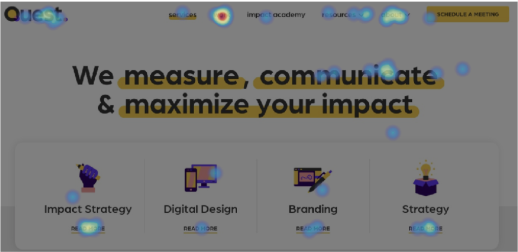
i.e. Persona 1 Goal: rebranding 

Frustration point for Persona 1 
Quote: “The branding case page does not show enough branding information: branding research,  Color design, logo design, typography, and so on.”
“Some examples mix multiple businesses. So I will wonder how the team is divided up”

Problem 3

Quest’s visual and textual emphasis on Design for Social Innovation rather than Branding and Strategy.

Right is a competitor who is good at branding and strategy. Their visuals have a unified style. 

Left is the Quest agency home page

Research strategy to solve the problem

Interview Insights

Problem 4

 Together we sort information and find out what is the most important information. Key feedback includes: 

The elements and ideal flow that can build trust differ for different target users.
“The first impression is Quest is not an agency focused only on Branding. From the detail like font, Color system, and illustrations. ……Some terms were not explained. When I click buttons to go to the next page, the elements at the beginning are always repeated.” (More than 2 respondents had similar expressions)
Introduction: “For trust, I would like to get more information about the members of the agency, which gives me the feeling of interacting with specific people. I also need case-specific information, for example, I would like to see feedback on this case, both from customers and from the community press to see more of the impact of this example on the community” (more than 4 respondents had similar expressions)

Competitor Research

I researched 10 of my best competitors and collated the research into the best practice table as a catalog. This was combined with previous interviews as a guide to support redesign.

Final Research Hand-off Slide

Reduce non-essential interactions and extend the time the user spends on one page. 

User flow before
User flow after
Increase the amount of information.

Based on the above, find the shortcomings of Quest’s website and provide the best possible solutions in the industry.

Brand Design page Contents Before
Brand Design page Contents After

Learnings & Challenges

I find that the process of building trust such as communication, community credit, etc. – is better “over-designed” than undesigned. For the user, this indicates that we pay attention to subtle needs.


An old fashion card sorting can help me quickly get the sorting method from the user.

Other Projects

Skip to content