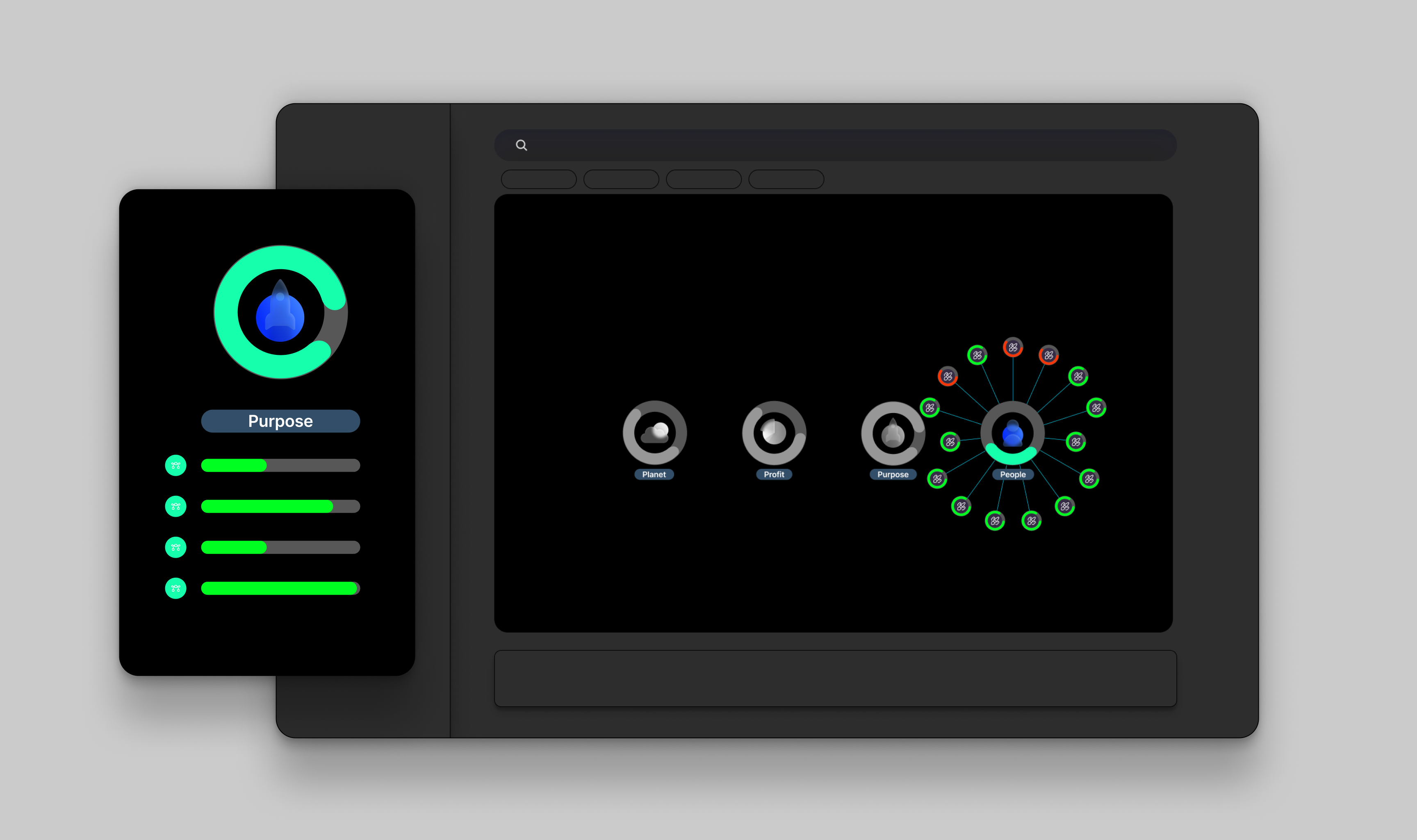
SyntegralAn AI conversational platform aiming to help institutions and individual investors to explore impact themes.
What I did We redesigned Syntegral’s social impact theme dashboard structure, diagram, and users’ filter and searching experience of the data.
Background
Syntegral AI is a Data Visualization version of chat GPT, and interactive data operation page design is challenging. I work with 1 CEO, 1 CTO, 1 developer, and 4 data analysts to better group the data set and make it easier to search and interact.
Syntegral AI wants to make it easier for social impact managers to access a company’s social impact data in a comprehensive and equitable way, but this depends on the impact asset manager’s understanding of the concept of social impact. Given that a greenwashing company may be good at food security but bad at sustainable resources and employee rights, Syntegral AI had to do more to inspire the impact asset manager to develop new ideas for data selection.
Duration
-
13 Days Agile Project
Client
Tool
-
Figma, Principle, Miro, Hype 4
RoleDesign Researcher & UI/UX designer
Challenge
Users(social impact managers) struggle to navigate the social impact theme dashboard, filter, and understand the data. The unclear data hierarchy leads to overlooked small datasets. Ultimately preventing users from making informed decisions.
From conception to design & prototype in 3 weeks
Approach
I worked with data analysts and strategists to break down complex theme dashboards into an interactive diagram with three layers of info. We aimed to make it more accessible and understandable for everyone, regardless of their level of expertise.
Final Solution
Design Process

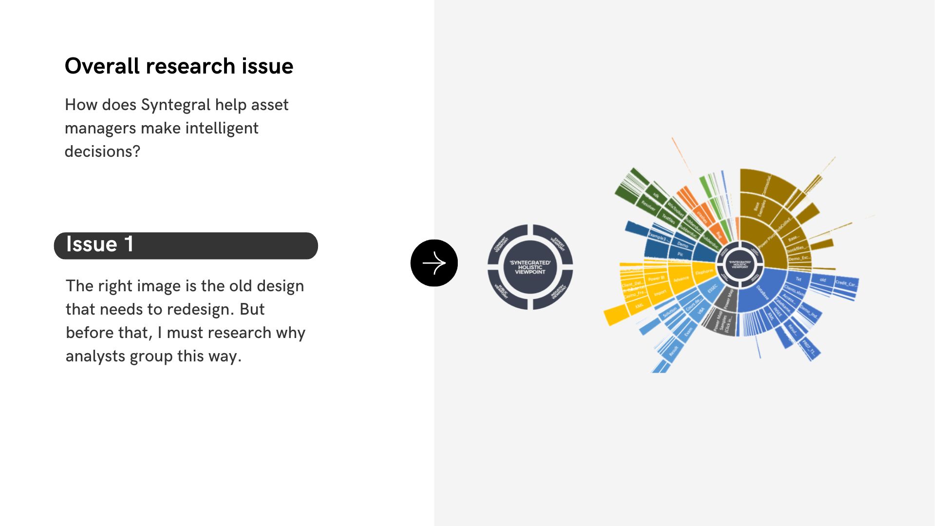
Phase 1: Design Research
In compliance with the non-disclosure agreement I signed, I have omitted sensitive data and obfuscated figures. All information in this case study is my own and does not reflect the views of Syntegral. I’m happy to share more details verbally during the interview 🙂
Here are some toolkits for me to kick off Product Discovery.
Conclusion of the meeting: After going through the product discovery, we decide to redesign the home page data set operation page.
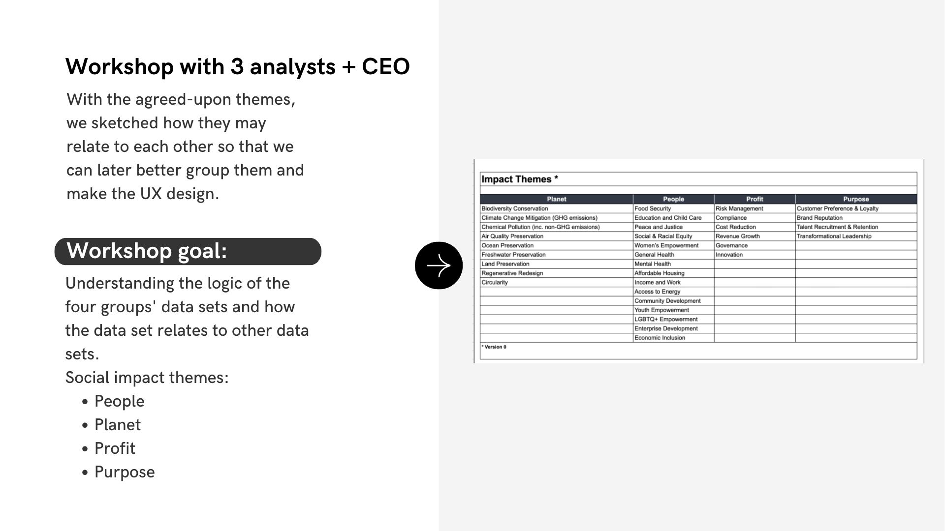
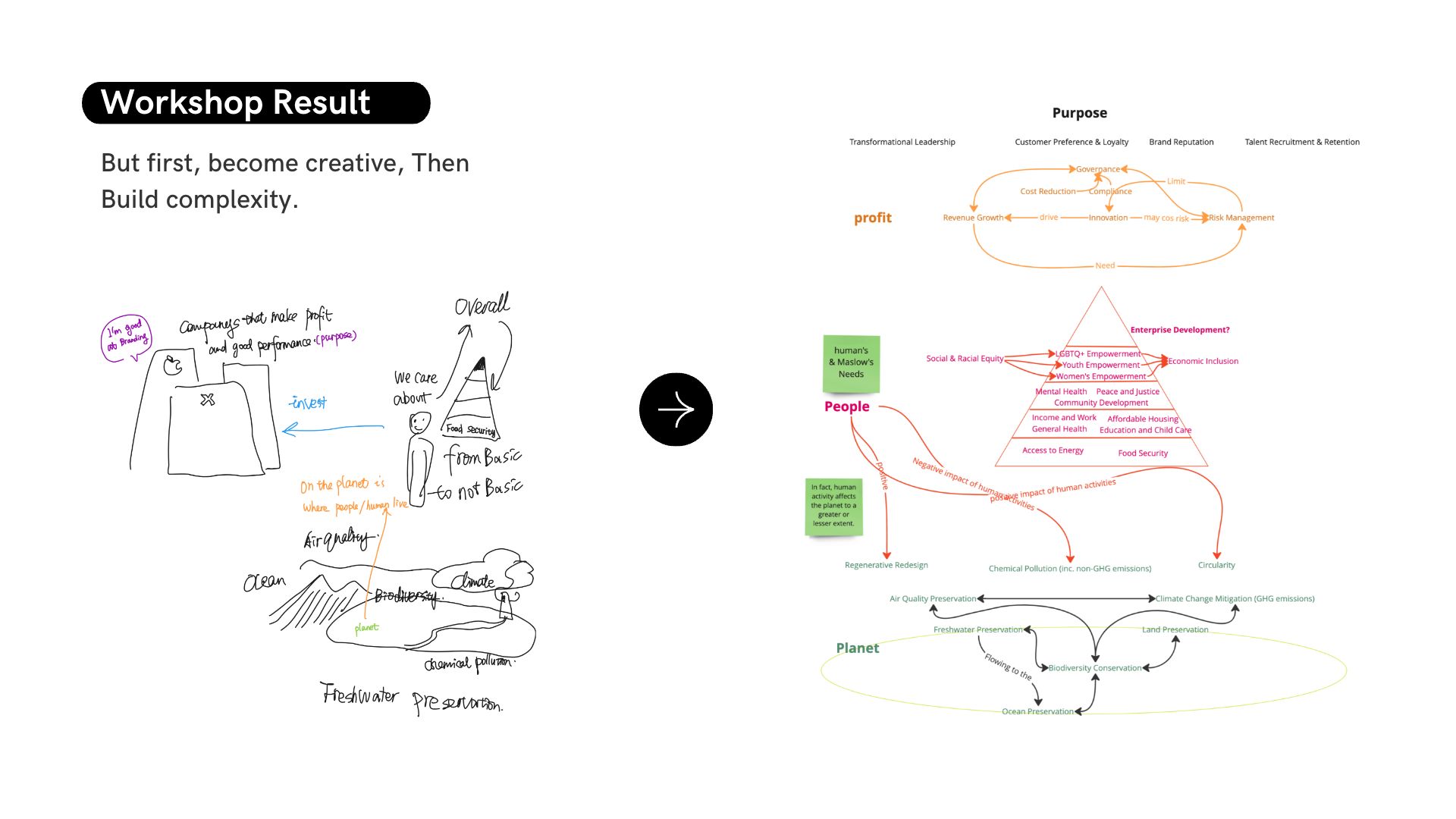
Position Workshop
Previous
Next
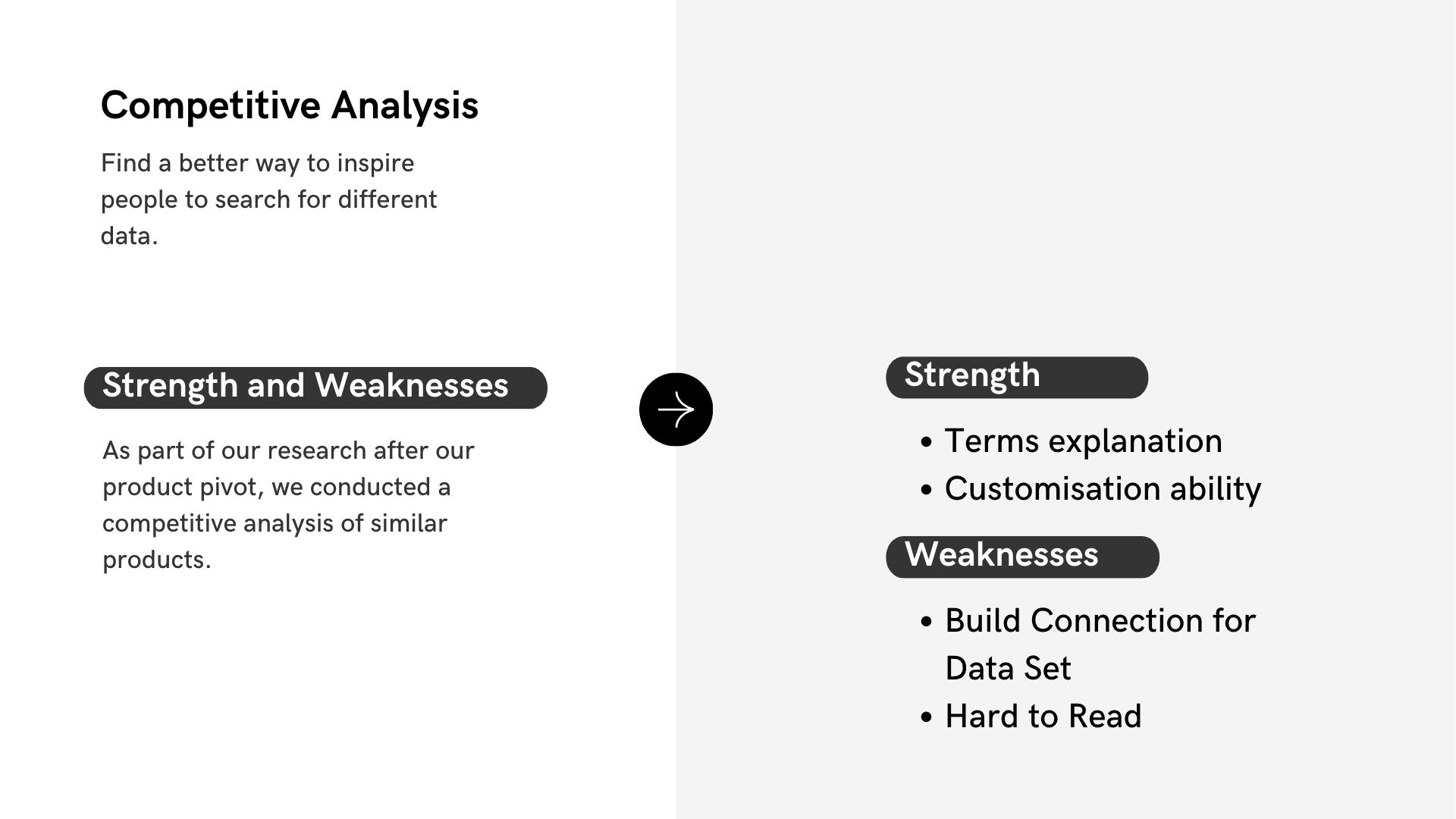
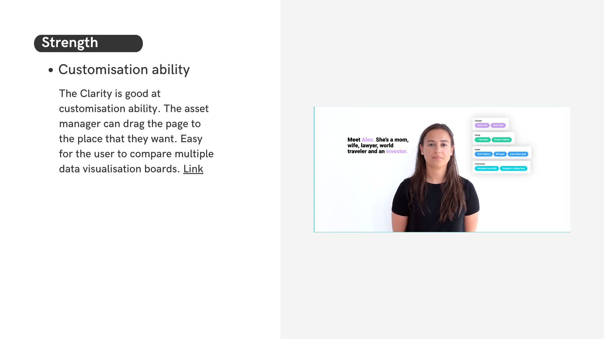
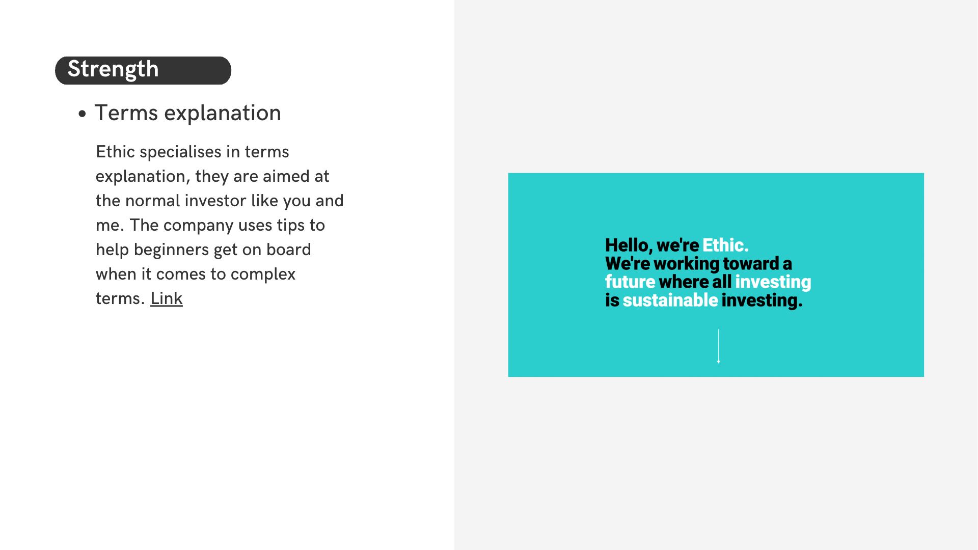
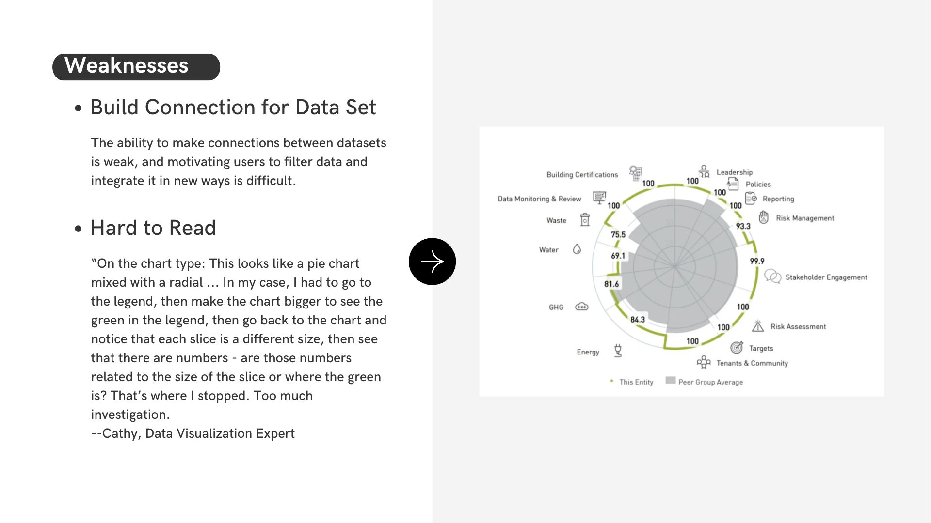
Competitive Analysis
Previous
Next
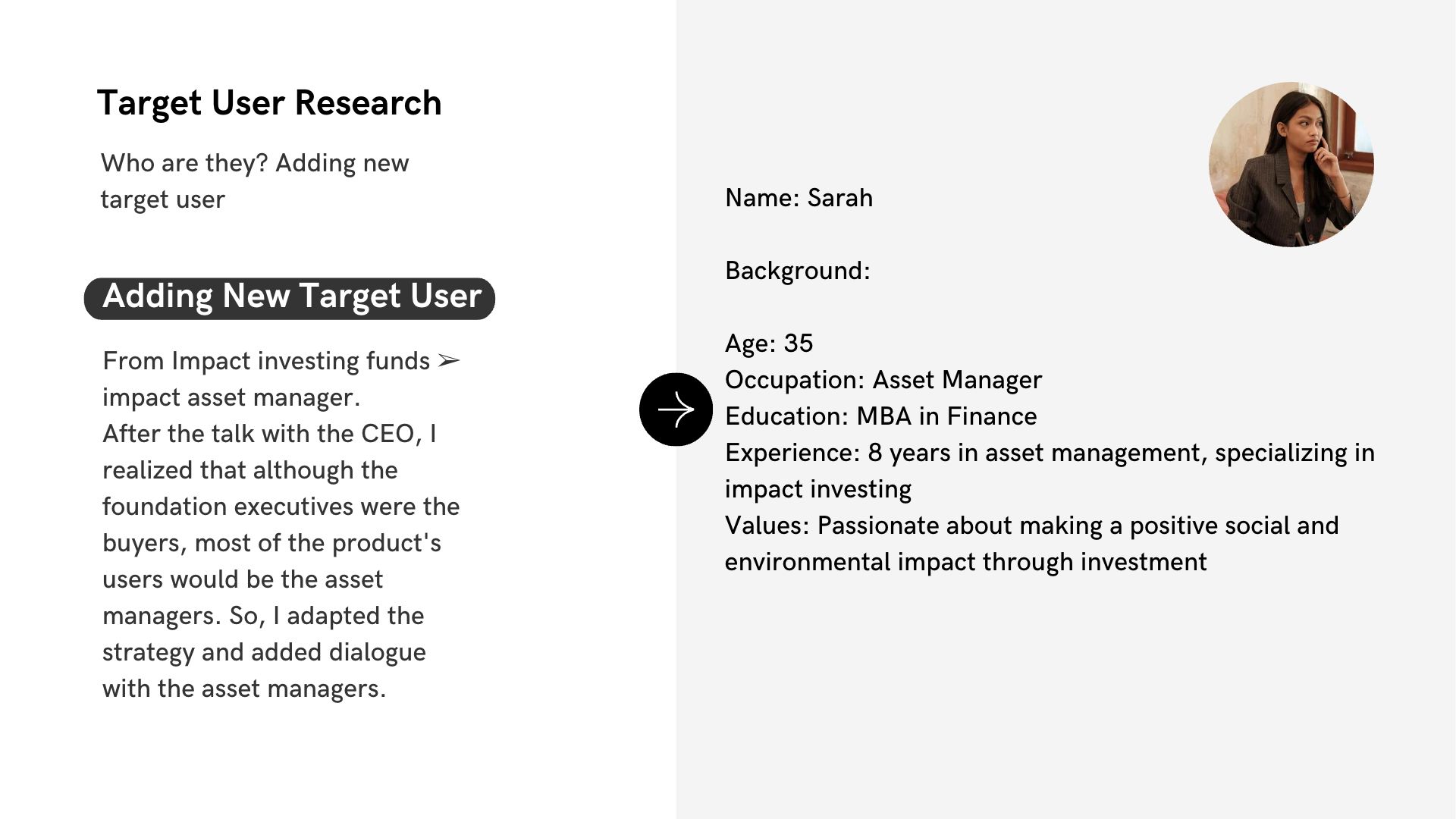
Target User Research
Interview Insights


Initial Insights Syndegatal’s strength lies in its rich dataset, which is unique among the competition. After discussion, we decided to design a three-tier structure for the data interaction pages and to focus on creating links between the large and small datasets.
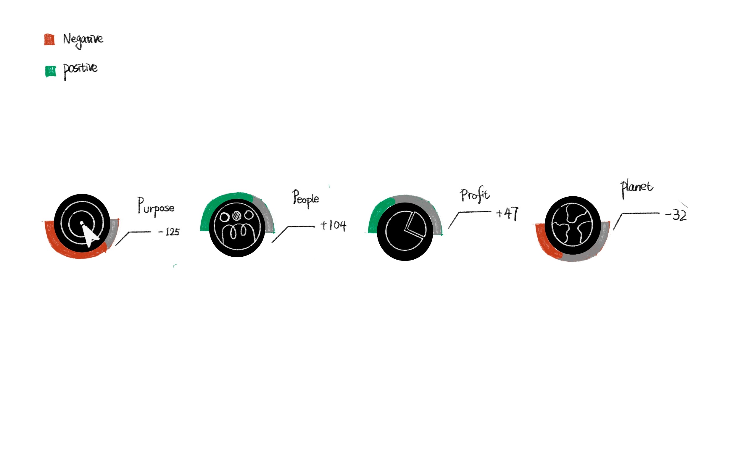
Phase 2: Ideation Wireframe sketches


Tier 1 design. Simple and easy to call for action.
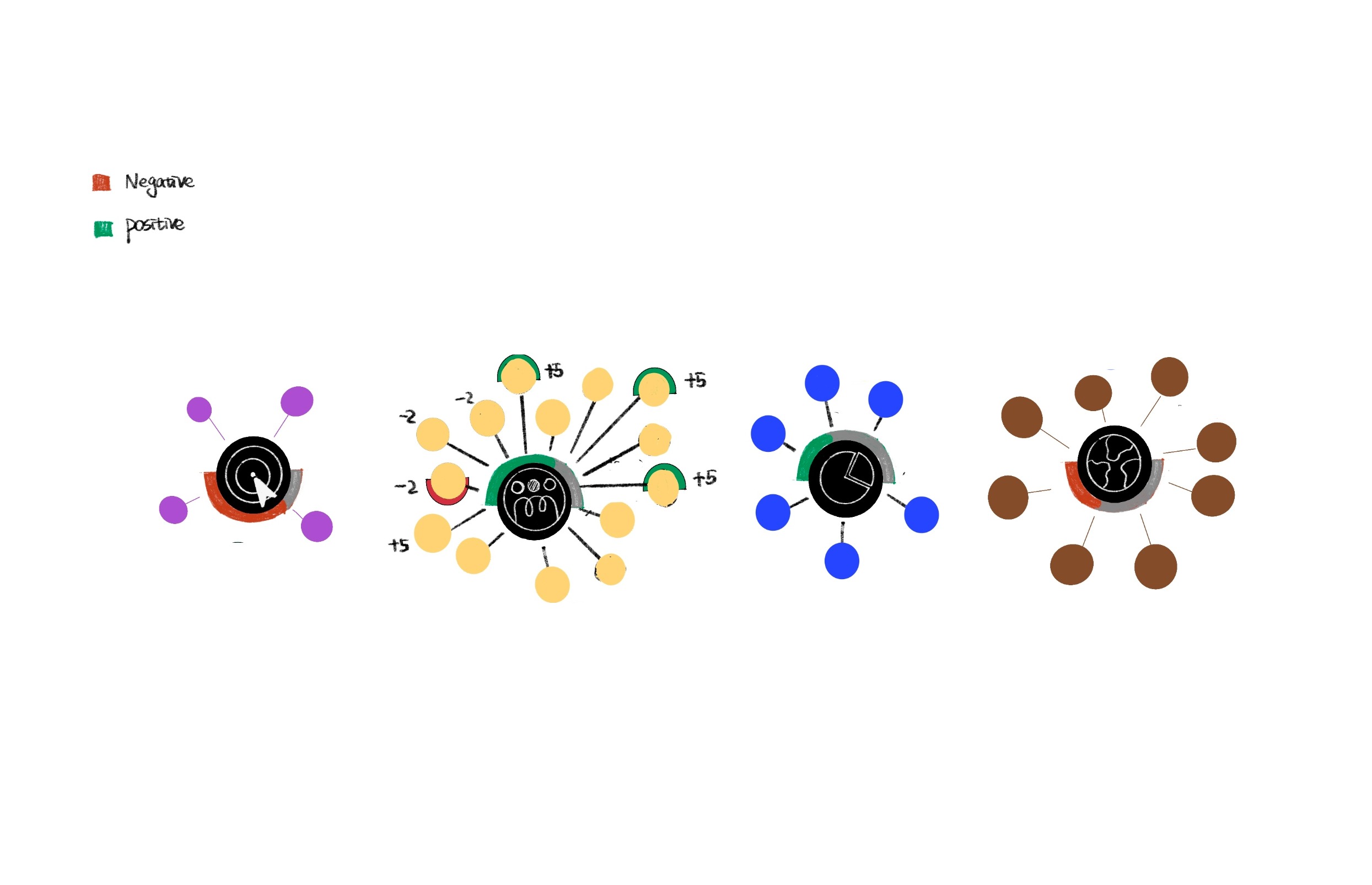
Tier 2 design. Show more detail.
Sketch 1
Phase 3: Interaction Design
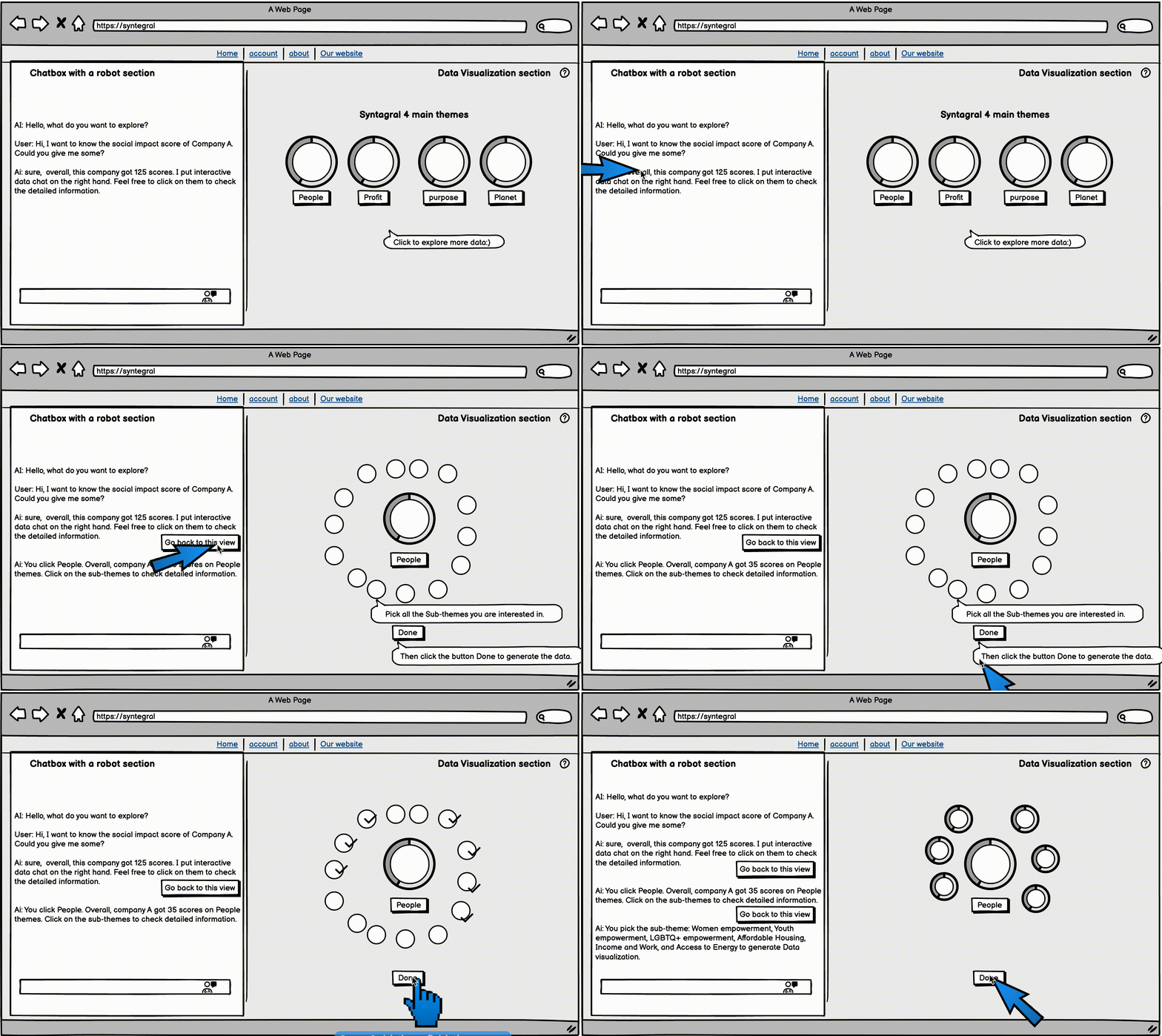
Low-Fidelity Wireframes Final Structure
Focus On relevent data
Making connections for data
“>”>Easy to compare”>
Clarity
Simple to use
Visual Unity”>
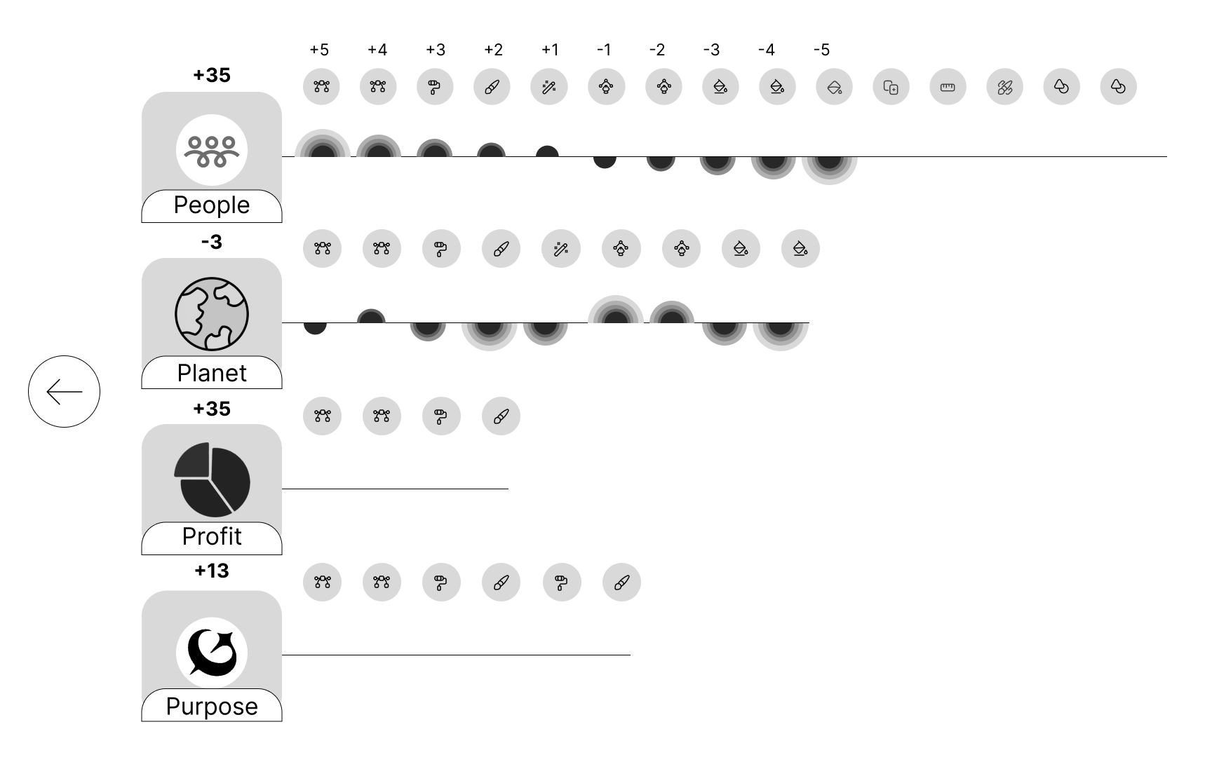
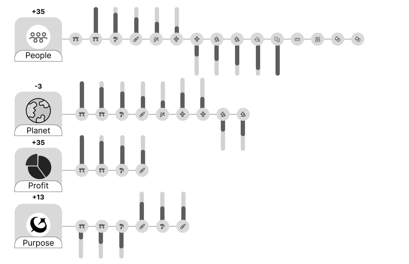
Overall score design is the most tricky part, we tried several ways to make the information easy to compare and visually appealing
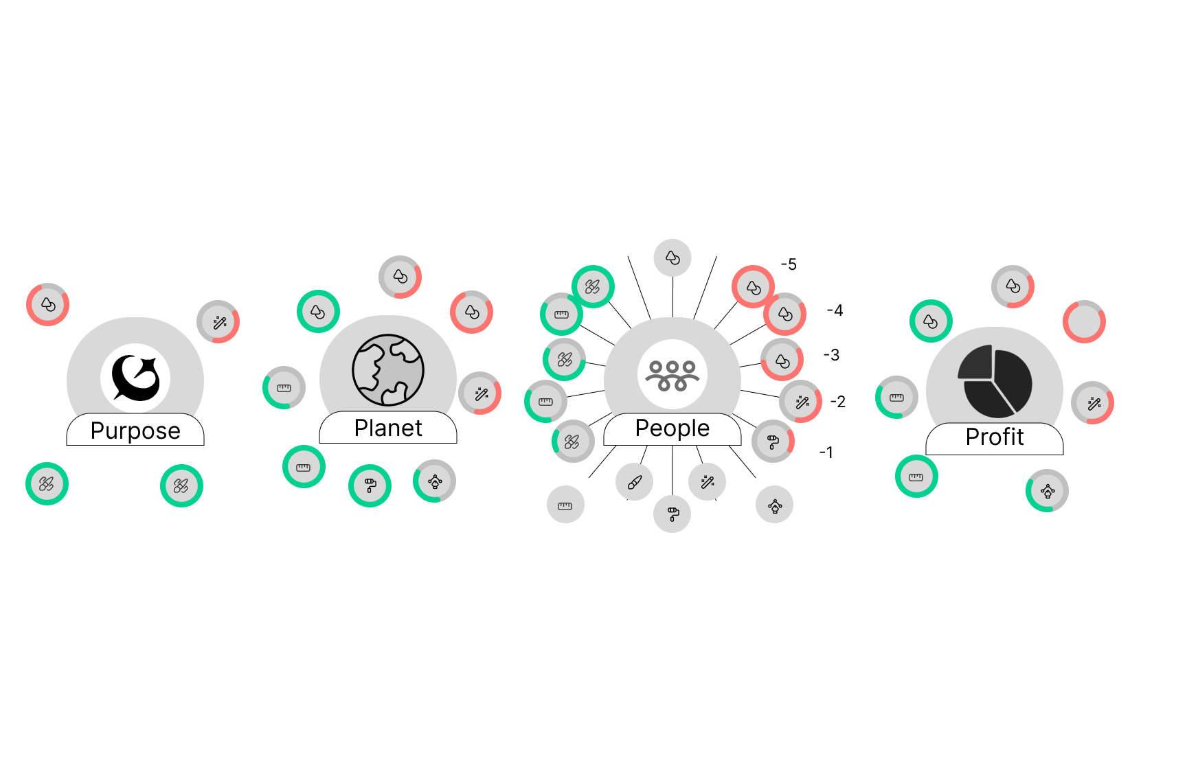
Other Sketchs
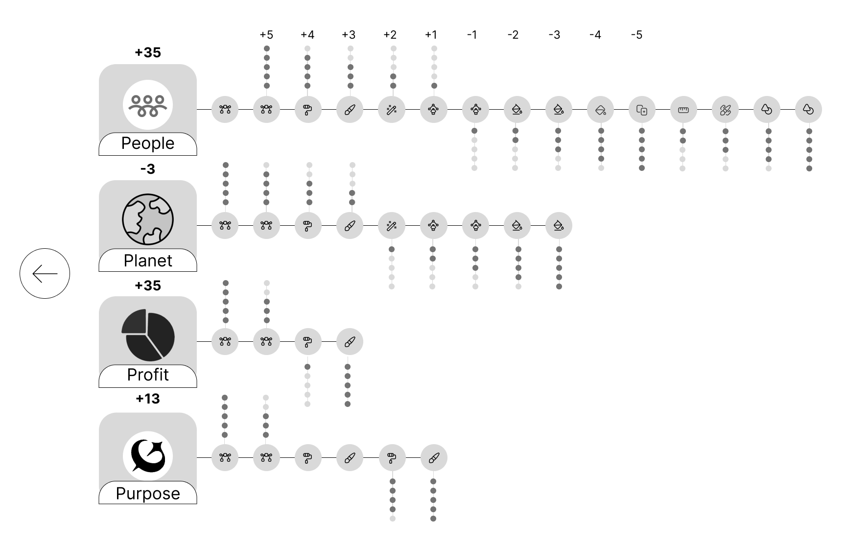
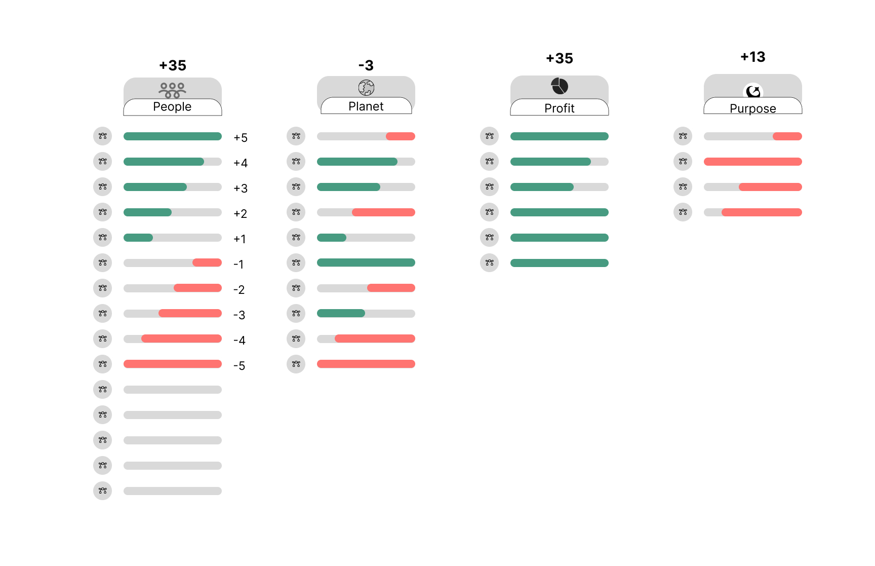
Phase 4: Design & Branding
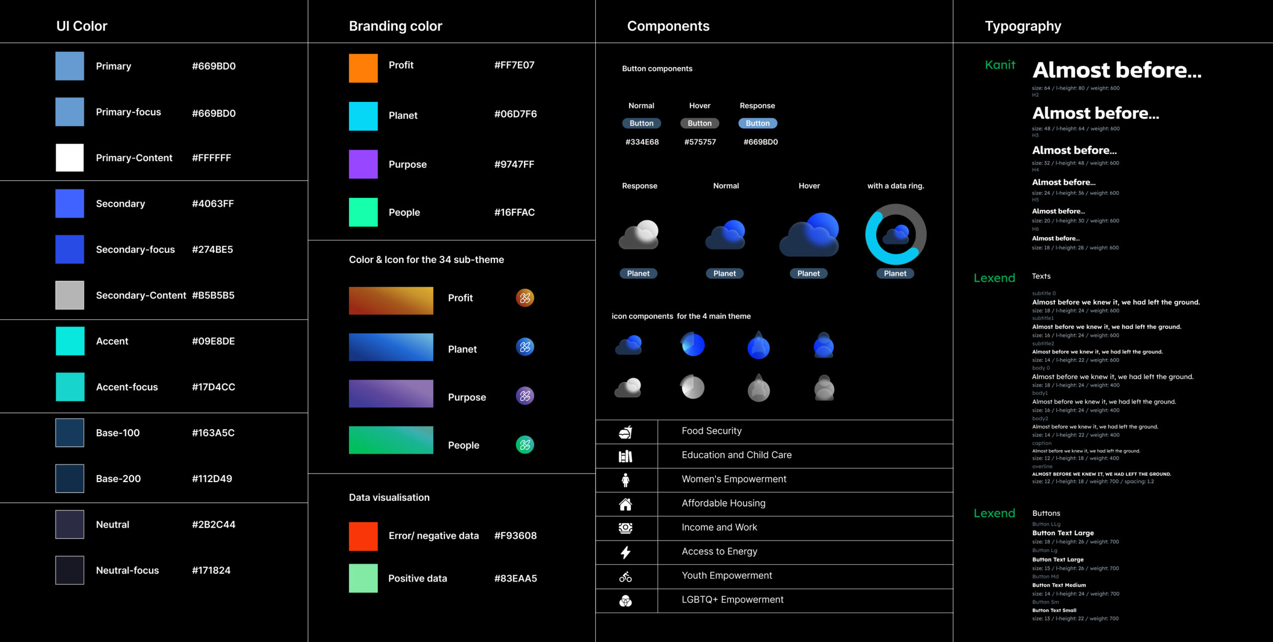
High Fidelity Screens With Motion design
Home page social impact theme dashboard
L1 Info only reviews main themes and calls for action.
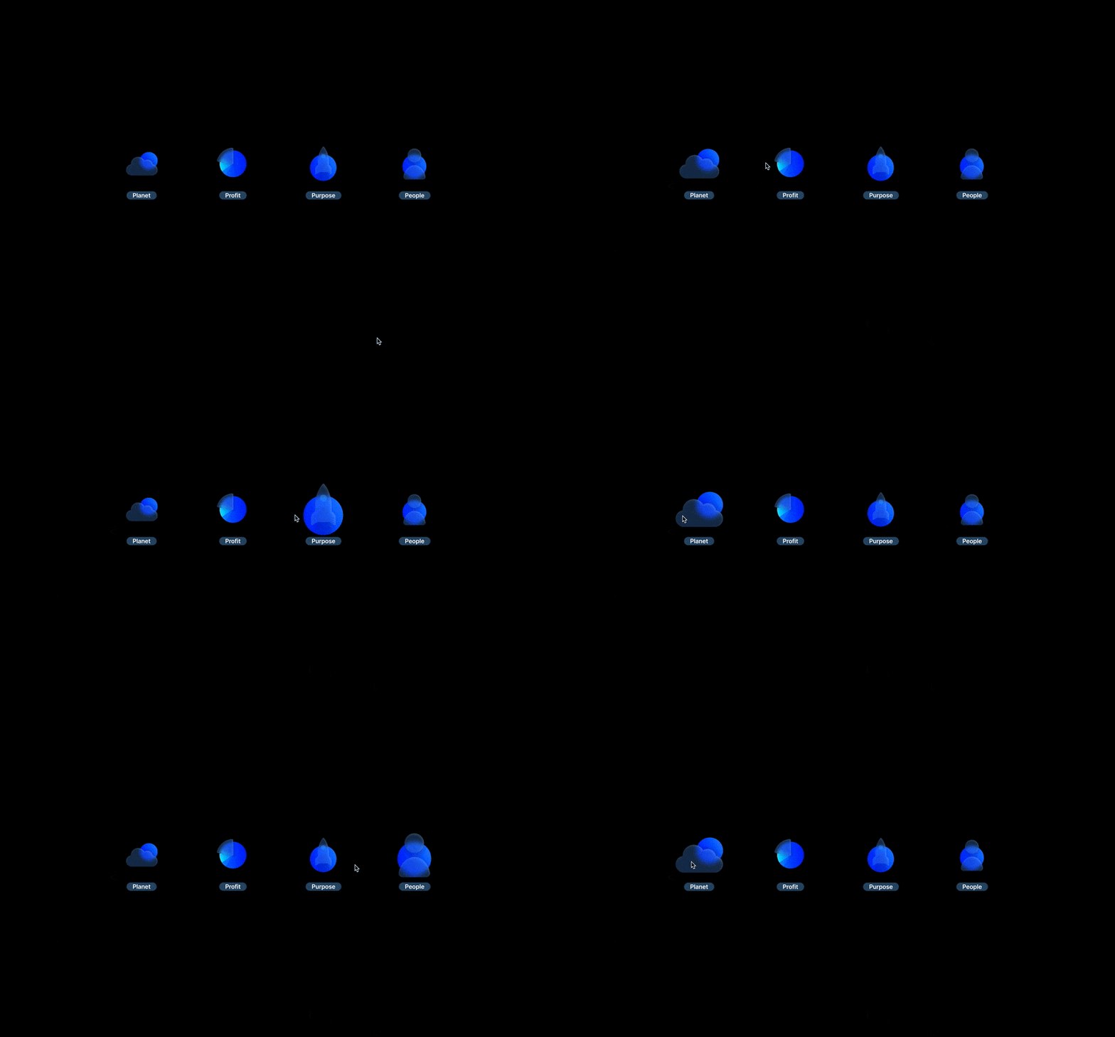
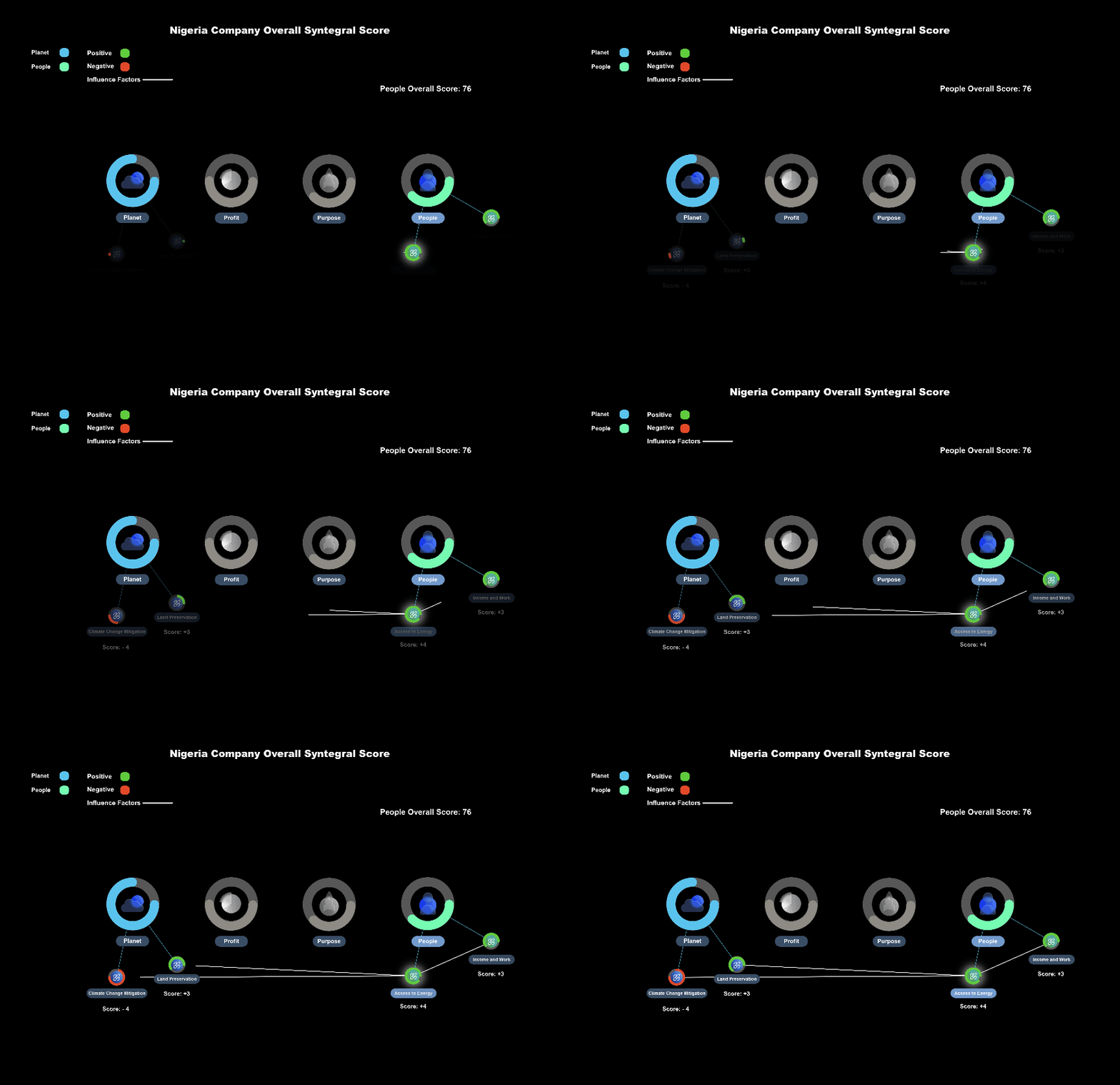
After putting keywords in the chat box
Such as type: give me a Nigeria company’s overall Syntegral Score.
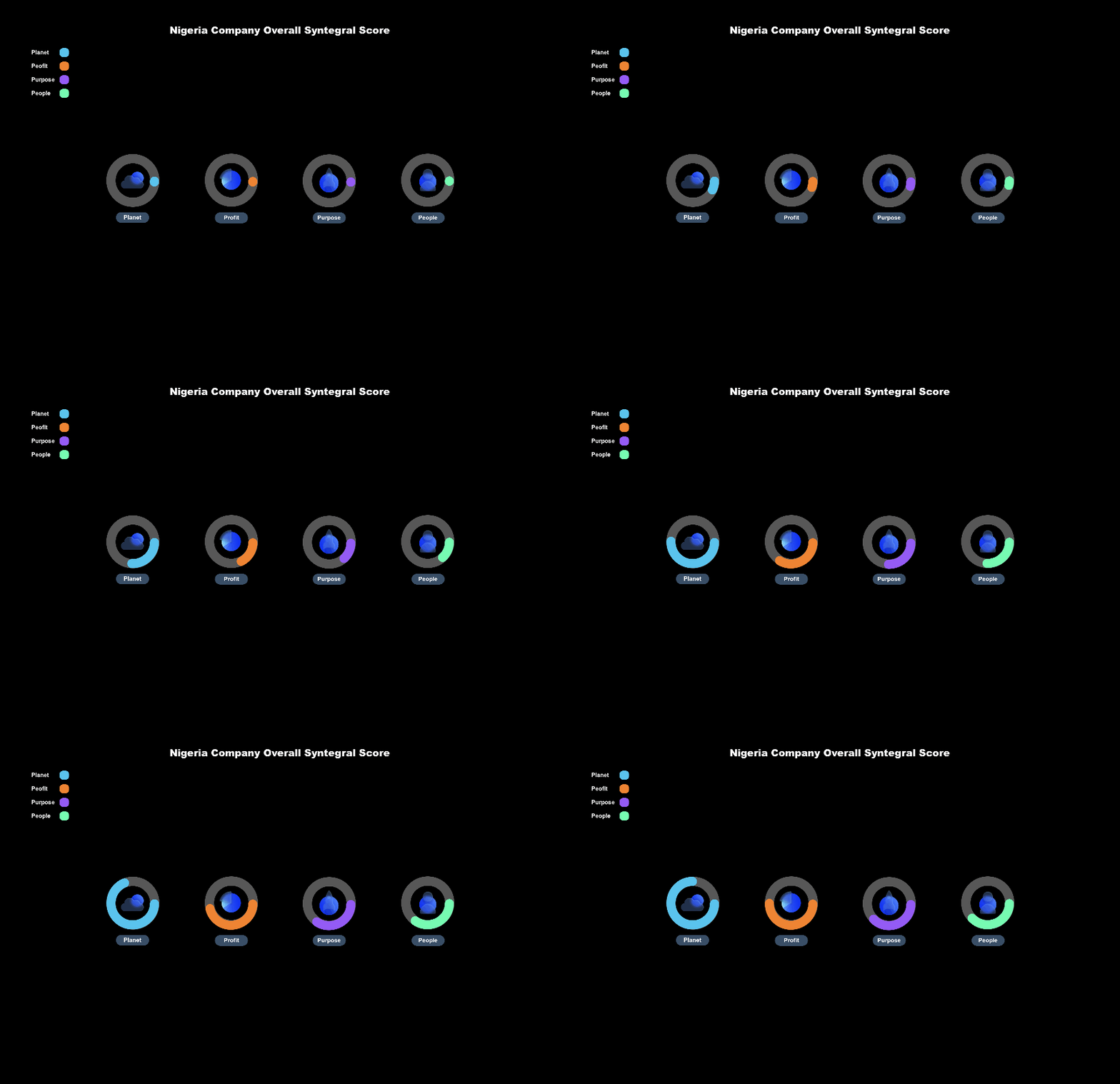
One Theme View
After picking one theme, you can see how other information becomes grey. The color and the Motion design only showed in the data users are currently concerned about.
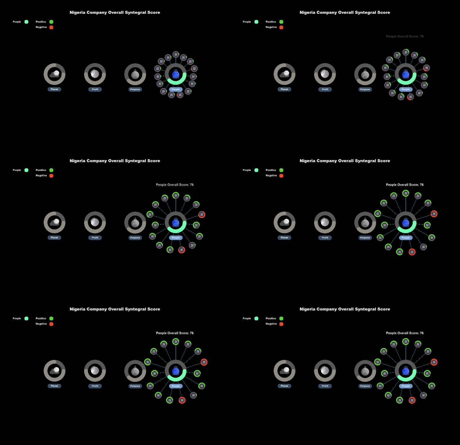
One Sub-Theme View.
After picking one sub-theme, you can see how other related information becomes colorful.

Home Page overall score section
Learnings & Challenges
During the Alige project, I learned that retargeting the right users and gathering accurate feedback from them is crucial to designing a successful product. To achieve this, I decided to devote 80% of my time to research and creating a Lo-fi prototype. This allowed me to gain a deep understanding of the user base, their motivations for using the tool, and their next steps after using it.
Furthermore, studying existing products in the market has proven to be a valuable strategy for enhancing my design skills. By recognizing the limitations and weighing the pros and cons of these products, I have expanded my mindset and have been able to develop innovative solutions.
Next Step
Imporve the platform dashboard structure.
Fix the design debt, making every component fit the design standard.
To be Continued…
Other Projects
NOMBOLO
Geo-based Soical Media /
UI /UX design
TOYS CAN
App & UI & UX & Research
VISUAL EPIDEMIC
Web, HTML, Motion Graphic